‘Above the fold’ and other web design myths to ignore in 2020

There are several myths and misconceptions that often get thrown around in the sphere of web design. However whilst these rules may have applied at one point in time, they’re not always totally accurate for the websites of today. Here’s 5 web design myths that we have debunked for you:
Myth #1: People don’t scroll below the fold
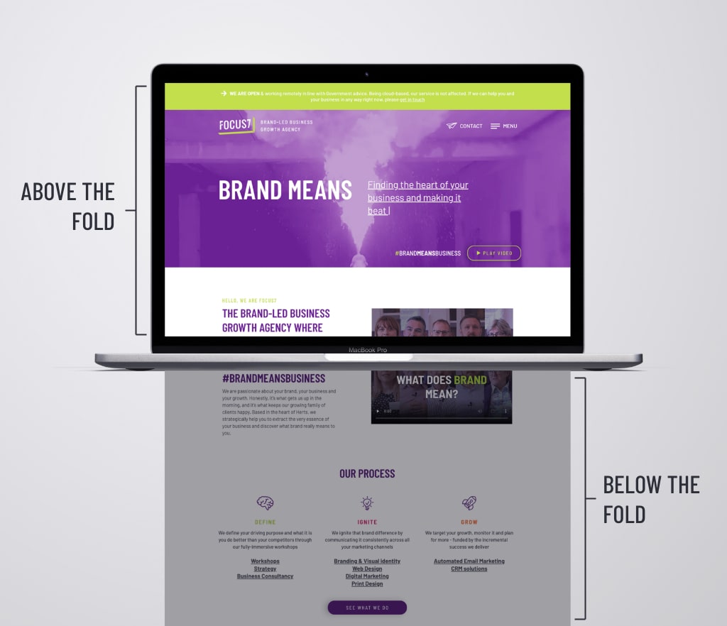
The term ‘above the fold’ actually predates the digital era and was first coined in relation to broadsheet newspapers. Newspapers are usually displayed on newsstands folded in half so that only the top half of the front page is visible to potential punters. Editors quickly realised the value of these first column inches and filled them with the most attention grabbing headlines, images and stories in order to entice passers by.
These days the same principal pretty much translates to website content. However the ‘fold’ now refers to the area of the screen that’s immediately visible without scrolling down.

For a long time, best practice was considered to cram all your most important information and calls to action ‘above the fold’. In fact, a 2006 study by Jakob Nielsen found that 77% of visitors to a website do not scroll, and therefore only see the portion of the website that is above the fold.
But that was then, this is now. How relevant is the fold in 2020?
We’re a nation of scrollers
These days scrolling is a second nature – browsing through your Facebook feed, scrolling through Instagram, even reading this blog. We’re very used to the seamless experience of scrolling on touch screen devices and gone are the days of those old clunky mice with the scroll wheel (thank god! Who remembers those?).
As of late 2019, mobile traffic now accounts for roughly half of all website traffic and one study found that 90% of mobile users would start scrolling within 14 seconds.
With the prominence of parallax effects, scrolling now can be used as a way to enhance the journey and storytelling of your site. Take a look at the ‘Google Pixel 4’ web page .
There’s hardly anything above the fold but as you scroll, more and more bitesize pieces of information are displayed, videos play, and clever animations suck you in. It’s a conscious decision to ignore the same old and instead embrace newer technology and browsing behaviour.
A plethora of screen sizes – one ‘fold’ does not fit all
There are COUNTLESS different devices (just take a look here if you don’t believe us) and on top of that, an infinite number of operating systems, browser settings and text sizes that could have an effect too. For this reason the ‘fold’ varies massively and it can be impossible to predict.
Whilst it can still be useful to keep in mind the viewport height of some of the most popular devices when designing, you have to accept that it will never be 100% accurate.
Myth #2: Your website needs to be copy heavy to have a high search engine ranking
For a long time it was generally thought that the more copy on your website, the better for SEO. And it should be packed full of the same keyword over and over. Shockingly, this isn’t great for user experience.
Google now recognises keyword synonyms, phrases and variations and can actually penalise you for simply relying on keyword density. For example if you were writing a blog about bath bombs, traditionally you might have tried to use the word ‘bath bombs’ as many times as possible. As you can imagine, that didn’t create for the best written content and so Google now prefers you to use a range of related keywords and phrases (such as… bath bombs, the best bath bombs under £5, bath products, bath fizzes…you get the idea). This reflects a general move to reward quality content over quantity.
There is also a whole host of other factors Google looks at to rank your page. According to Blue Corona, these are the top 11:
- Secured sites (HTTPS vs. HTTP)
- Websites that are mobile-friendly
- Schema markup
- Webpage content quality
- Webpage content length
- Page speed
- Social signals
- Quality backlinks
- Optimized images
- Domain age
- User experience (UX)
You can see a handy infographic of all 200 of Google’s ranking factors here
Myth #3: You need to make wireframes before designing a website
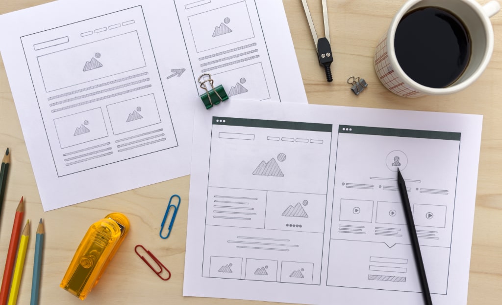
A wireframe is a layout of a web page that demonstrates what interface elements will exist on key pages. Typically it looks something like this:

And is used to quickly mock-up a website concept so that stakeholders can review the layout and content hierarchy and designers can test concepts without fully designing a detailed prototype.
Sounds good, right?
And it can be, given the right audience. However, the idea that this step is essential to every web design project is a myth. Often clients find wireframes difficult to understand. Within the design community it’s common practice and therefore we often make the mistake of presenting wireframes to clients who are less technically minded or perhaps have never seen a wireframe before, and expect them to just ‘get it’. Sometimes a design needs to be seen to be believed (or understood) and a bunch of grey boxes don’t allow the client to visualise the end product and get excited about your creative ideas.
In order to get the general concept across quickly, it’s better to go old school and just sketch it out on a bit of paper. You could even do this directly in front of the client to ensure they fully understand your vision.
Also with the introduction of tools specifically for UI design such as Sketch, Figma and Adobe XD, creating full high-fidelity mockups is actually a lot quicker than in the past. This negates the need to create ‘quick’ wireframes as these programmes make it really easy to create iterations of a full design.
Myth #4: The mobile version of your website requires fewer features than the desktop site
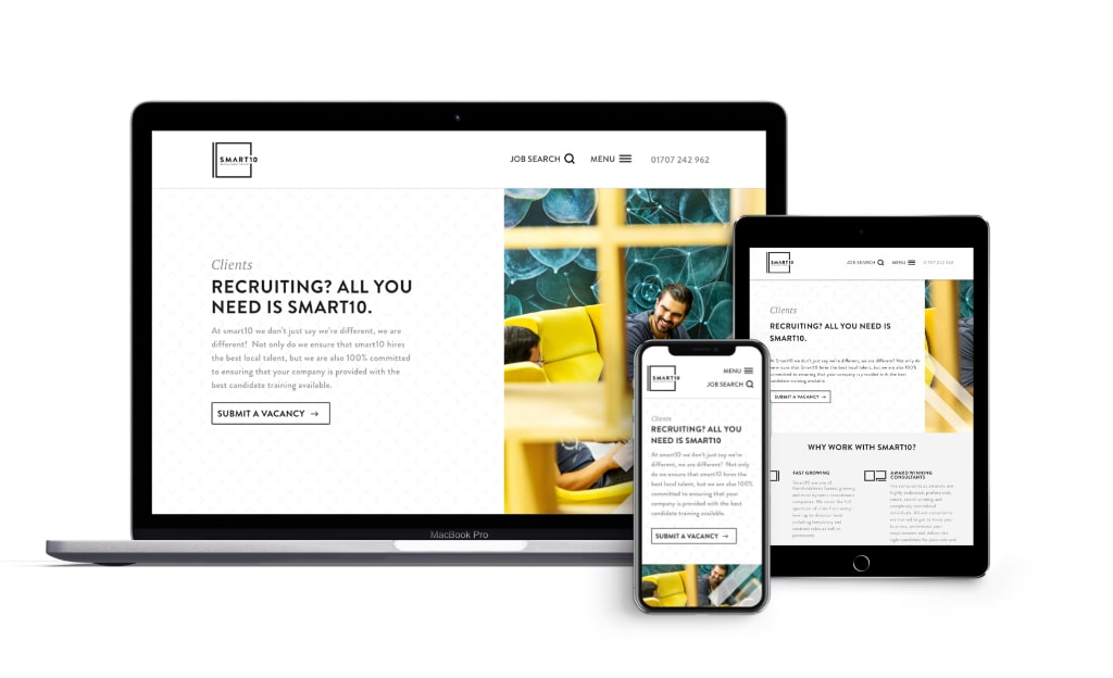
Often people see the mobile version of your website as a ‘dumbed down’ version of your full desktop site. This does not need to be the case. If features are important to the experience on your desktop site, chances are they should also translate to mobile.
With the percentage of mobile web browsing increasing, users are no longer just using mobile browsing on the go with dodgy 3G connections. They’re using their phones at home sitting on their sofa, at their desk and even in the bath. If you leave off features on your mobile site, you could actually be excluding a large part of your audience.

When designers create a beautiful and functional desktop website, it can be difficult to find a way to shrink it down for the small screens. For this reason, it’s often a good idea to design mobile first and then scale up to desktop. This way you’ll ensure your mobile users will have a great experience designed with mobile use in mind.
Myth #5: Once you ‘go live’ with your new site, the job is done.
Going live with your new website is a big milestone and can often mark the end of a long and complex process. Your natural reaction might be ‘great, I can check that off the to-do list for good now’. Actually no, websites are living, breathing advertisements for your brand and should be constantly updated to ensure they reflect you and your business.
Here are several reasons you should keep your website up-to-date:
- To update redundant content – it looks unprofessional and may put off potential customers.
- To reflect your business evolution – businesses are constantly evolving and changing. New staff are hired, new services are offered, processes get updated and your website should reflect this, too.
- To better meet your audience’s needs – technological advancements might make a new feature available that would greatly benefit your customers.
- To keep up with competition – make sure your site is still the best in the business.
- To improve the user experience – as you monitor your website’s analytics you might find that there are areas that aren’t working quite as you hoped, and these may need to be revisited and updated.
- To stay relevant and on trend – maybe there’s been a big shake up in your industry and it’s a topic that’s attracting a lot of traffic. Capitalise on that by making sure your website reflects the latest news.
Key takeaways
Technological developments have had a HUGE impact on the way we view website design. A lot of these myths were, at one point in time, based on careful research and observations. But due to the advancements in technology, changing browsing habits and the tendency to lean towards user experience and accessibility, by 2020 the rules have changed.
Focus7’s UX experts are always happy to advise you on the best UX practice and latest trends. Give us a call on 01462 262362 or email us at hello@focus7int.com to start a conversation.


